Do You Tri?
K. I HAD to post this LO of my hubby. I am SO PROUD OF HIM!!

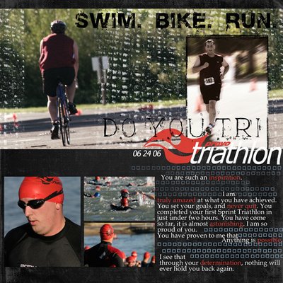
He completed his very first Triathlon today.
And he has worked so hard to get where he is. He started training in January. When he told me he wanted to do a Tri; I thought he was insane. Not being athletic myself; I had a hard time truly understanding his drive. But he was SO DETERMINED.
Through his training he has lost 45 pounds. And today, he went out there, and well, he just did it. He Swam 750 Meters. Biked 20K and Ran a 5K. I think he did awesome!
*ETA:
This layout was created with some simple black paper. I filled my document with black then added a pattern overlay with some great texture on it. I changed the blending mode to linear dodge and lowered the opacity a bit.
I grunged up the main photo with some grungy brushes;
The photo of my DH running, was actually a REALLY BAD PICTURE. So it required a ton of editing. I started by selecting him completely with my magnetic lasso tool. I then copied that layer (control J) so he was cutout on top of my photo. Then I applied a motion blur to the background, and then blended him back into the photo using my blur tool. It made for a really cool effect; and my DH loved it because he thought it made him look faster ;)
The only other elements that I added were Nancie's Shmootzy Frames around the photo of him running and My Graphic Brushes around my journaling.
The red swirly thing in my word art is actually the logo from the race. It was created by scanning in my DH's T-shirt and making a brush out of it.
The fonts used here are: Base 02, Appendix3, & Book Antiqua.

<< Home